
Vocab-Carry
A new vocabulary learning mobile app
.png)
Role
UX/UI Designer

Duration
1month
.png)
Tools
Marvel
Adobe XD
Figma
OVERVIEW
About the project
Vocab-Carry was the first project I built as part of my UX design course at CareerFoundry. As an expat, I can relate to the frustrations while learning a new language. Inspired by this, I believe an easy-to-use and intuitive mobile app can bring a positive impact. With that, I applied what I’ve learned to create a high-fidelity prototype and conducted usability testing with the participants to see how I could improve the design to meet their expectations.
Objective
Before I started to design, I conducted user research. I found out that most participants have different motivations and use multiple apps to learn a new language vocabulary. Further, they care more about whether they can gain more new knowledge rather than reviewing what they have learned. To meet the users' expectations, I would like to focus on how to access the community knowledge and have them be comfortable while learning a new language.
Process
I've applied the Design Thinking process as working through this project. Below are six phases from research to testing that I've followed to build my application.
01
Competitive Analysis
02
User
Research
03
User
Persona
04
User
Flow
05
Wireframing
& Prototyping
06
Usability
Testing
01 Competitive Analysis
To wear the same shoes as the users, I started to conduct a competitive analysis to learn what the competitors are good at so I could implement them on my application. Besides, I could be aware of their weaknesses to improve them to make me stand out from the market. Here are three vocabulary learning apps I conducted the competitive analysis: Quizlet, AnkiApp, and Flashcard with Cram.
Main takeway

Quizlet
From Quizlet, I would like to implement the color contrast it applies to make some points stand out, and the auto-generated function, for example, when the user types "What does personality mean?", it will show a couple of the definitions that suit this string the most. However, from the other side of the weaknesses, I would like to improve them by adding the selection of the preferred language and having the related information on the onboarding pages.

AnkiApp
From AnkiApp, I would like to implement the function that has the built-in community study set, which allows the users don't need to start from scratch to build up their own. However, from the other side of the weaknesses, I would add additional single sign-on options on the sign-up page and avoid having too many features to overwhelm the users.

Flashcard
with Cram
Learning from Flash with Cram, I would apply minimalism to my app. It would be easy for the users to know where to add the cards and review them. However, from the other side of the weakness, I would avoid using too many colors to overwhelm the users and make the search bar more obvious.
02 User Research
Before getting into the design phase, I conducted four user interviews with five questions to understand our potential users’ needs first. To get different perspectives, I took the genders, ages, professions, and locations into consideration.
Interview questions
-
What makes you want to learn a new vocabulary? And how do you feel about it?
-
When was the last time you tried/had to learn a new language vocabulary?
-
How do you learn it? (Not limited to an app, for example, Flashcards) And what do you like & dislike about it?
-
When you started to learn new vocabulary on an app, how long did you spend?
-
How often did you study vocabulary in the last year?
Insights
Most participants have different motivations for learning new vocabularies, for example, for a degree, work, relationship, etc.
Every participant uses different tools to learn a new vocabulary, like writing flashcards, reading language books, watching YouTube, etc.
Most of them care about whether they can gain more new knowledge while they use the tools rather than reviewing what they have learned.
03 User Persona
Based on the result of user research, I developed a user persona to represent the potential users. Here is the proto-persona called Louise with his demographics, behaviors, needs, and goals.
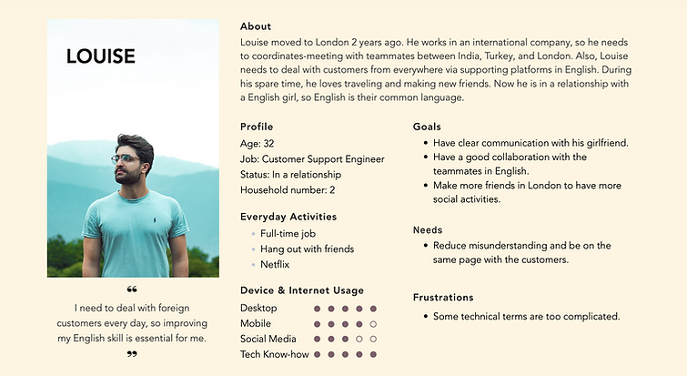
After creating a proto-persona, I started using the user stories to refer to them, which allows me to focus on defining functions and solutions from a specific persona’s perspective.
User Stories
-
As an employee working in a multi-language environment, I want to improve my English writing, listening, and speaking skills to have a smooth conversation with my colleagues.
-
As a full-time customer support engineer, I want to learn some technical terms in English in an efficient way so that I can make sure the customers and I are on the same page.
-
As a foreigner in London and in love with traveling, I want to practice my English to fit into the local culture in London and enjoy the journey while traveling to different countries.
-
As a person in a relationship with an English girl, I want to learn more English slang and get used to the British accent.
By summarizing my research result, the proto-persona, and the user stories, I can concisely state the problem that the potential uses may have so I can try to resolve it.
Problem Statements
After a hard-working day, Louise needs a casual, fun way to improve his English skills because he needs to use English very often in his daily life.
We will know if our app is truly helpful for him when we see that Louise can finally talk to his colleagues fluently, resolve customers’ issues quickly, and doesn’t need to rely on Google translate when communicating with his girlfriend.
Hypothesis Statements
We believe that by creating an interactive learning app with fun graphics in flow, online social communities to practice speaking, tasks to review what you have learned instead of traditional text-based interface for Louise, after using this application for a while, he will feel more comfortable when he speaks in English every time.
04 User flow
Here are two task analyses in which I’ve considered all of the possible information and navigational issues surrounding the completion of a particular task.
-
Add a new study set from community

Entry point:
・New - onboarding page
・Existing - open app
Success criteria:
Save to my study set
-
Take a quiz
Entry point:
・New - onboarding page
・Existing - open app
Success criteria:
Take a quiz

05 Wireframing
At the beginning of the design, I used pen and paper for sketching to get more idea of the layout and used Figma to create the mid-fidelity wireframes. Here, I will focus on three main task flows: Add a new study set from community, create a flashcard, and take a quiz.
Mid-fidelity wireframes


06 Usability Testing
To validate the design, I conducted usability testing with four participants.
Scope
Usability testing with a low-fidelity prototype of an Vocab-Carry app.
Schedule
It will be completed on 1st, Sep. One will be in person, others will be Video calls.
Sessions
Four participants in total, and each session will take approximately 10 mins.
Equipment
Sessions were recorded on paper. The participants will share the screen with me.
Usability test report
From the usability testing result, we can see all the participants could complete the sign-up and the flashcard creating tasks without any friction. But they felt confused about the other two scenario tasks - add a new study set from the community and take a quiz. To resolve this problem, I have made the improvements below.
Task1
Observation: All the participants were able to sign up for an account without any friction.
Severity: 0
Task2
Observation: A participant felt quite confused about the difference between the two buttons.
Severity: 1
Recommendation: Add the word “collection” into the first button, which becomes “Create my own study set collection.”
Task3
Observation: All the participants were able to create a flashcard without any friction.
Severity: 0
Task4
Observation:
-
Felt quite confused about the definition of Level.
-
There are duplicated “Choose Study Set” which may confuse the users.
Severity: 1
Recommendation:
-
Add the definition below the levels.
-
Rephrase the title.
Improvements
Task 2 - Add the word “collection” into the first button, which becomes “Create my own study set collection.”


Task 4 - Rephrase the title and add the definition below the levels when the user selects them.


After conducting the usability testing and analyzing the valuable insights, I improved the mid-fi wireframes. Further, I've also upped the fidelity of my wireframes by following the visual design principles.
07 Final Design

08 Style Guide
Vocab-carry is about to provide an easy way for the users to learn a new language, so I would like to give a comfortable and relaxing vibe. One of the ways to engage the emotions is through the color palette and the tone of voice. Therefore, I chose to use a darker shade of green to represent its trust and safety for the primary color. Further, to avoid the bland white background, I use a light shade of green to bring some vibrant.
1. Color palette
-
Primary colors
#497D58
#F4FBF6
-
Secondary colors
#111111
#565656
#808080
#FFFFFF
2. Typography
Aa
Georgia
Header1 - View a study set
Georgia - bold - 24pt - Subpage titles
Header2 - View a study set
Georgia - bold - 18pt - Onboarding pages & Subpage titles

3. UI elements
-
Buttons states

-
Bottom navigation

-
Input fields


-
Icons
Bottom navigation
Conclusion
Content
.png)
What I've learned:
-
Sketching the wireframes for the first time can brainstorm more ideas.
-
Conducting the usability testing helps me understand the users and the whole process better.
-
Creating a user persona makes me focus on the target user.
Challenge:
The greatest challenge I faced was usability testing. Since it was my first UX design project, I was not familiar with the process. In the beginning, I didn't know what kind of participants I should hire, how to create a test plan, etc. By following the structures provided by CareerFoundry, I started with the usability test script to have a clear idea of what to ask and avoid the topics going off track. After a few practices, I become more familiar with the process.
Next step:
-
Conducting iterative testing to continue improving 6Pro's design and usability.