.png)
.png)
Role
UX/UI designer intern
Project overview

Duration
2 weeks
.png)
Tools
Figma
Photoshop
Tellow is SaaS company which has an automated accounting program specially designed for micro-businesses and self-employed people. It enables its users to have control over their own records at all times, by making their accounts understandable. As a B2B and B2C business, we opted to rebuild our present Review Page because users rely heavily on it to gauge how good we are.
Design Process
I followed the design process which includes the following stages:
01
Problem Statement
02
Research
03
Mid-wireframing
04
Final design
Problem statement
Before getting into the design process, it's better to identify the problem that needs to be solved or the goal that needs to be achieved. So I assessed the Review Page's current surface and found out there were few issues that may be fixed:
Outdated interface
Ineffective CTAs for installing the application
-
No appropriate spacing and appear disorganized
-
Inconsistent layout and visuals
Incorrect CTA order


Research
Due to the time constraints, I chose to start by conducting a competitive analysis to learn more about what the competitors are doing and using Google Analytics to observe user behavior. After gathering all the insights, I conducted the stakeholder interviews to discuss with them, understand their point of view, and come up with an agreement on requirements.
Competitive analysis
I focused on the other 10 bookkeeping companies operating in the market before starting the design process.
Main takeway
-
I learned that some companies don't have review pages, which I think provides us a competitive advantage.
-
Several companies posted more than nine reviews on this page.
Google Analytics
By obtaining data from Google Analytics, I was able to observe the user's behavior. I looked over the videos, heatmaps, and site analytics. By doing this, I can completely comprehend the users' patterns of behavior and the content they are interested in learning more about.
Main takeway
According to the analytics, there are two buttons for installing the application in the hero image of our present website, but less than 15% of people click on those buttons to download the app from this Review Page, which is ineffective. I decided to delete them and replace them with a newly designed CTA for a free account signup as a result of this.
Stakeholder interviews
Before making a design decision, it's crucial to involve the stakeholders in this stage as well to gather their point of views. In this project, the stakeholders are including: CEO, Marketing manager, Web developer. In this meeting for stakeholder interviews, I shared the findings from competitive study and Google Analytics and gather the feedback from them.
Main takeway
-
To maintain consistency, it is preferable to put the review score rather than the app ratings.
-
Since it concerns the consumers' privacy, there is no need to add the reviewers' photographs in each review boxes.
Mid-wireframes
I applied the key findings from the research to the design. I began by sketching and created the mid-wireframes by using Figma.
I started with the Desktop version because Tellow’s design strategy is more focused on it. And after that, I also took into account the mobile version because more and more people are getting used to using mobile devices to browse the content.
Desktop version
%201.png)
Mobile version


Visual Design
Style guide
In order to keep consistent with other webpages, I adhered to Tellow's existing design system, which currently uses the primary branding color and font type as shown below.
1. Color palette
-
Primary colors

#5538EE
#5970F0
#5950EC
-
Secondary colors
#000000
#9DA7B3
#EEEEFD
#FFFFFF
2. Typography
Aa
Plus Jakarta Sans
Header 1 - De best beoordeelde software van Nederland
Plus Jakarta Sans - bold - 48pt - hero title
Header 2 - Wat onze klanten vertellen
Plus Jakarta Sans - bold - 24pt - Subpage titles
Aa
Inter
Body text - Altijd actief advies dankzij Compleet
Inter - regular - 16pt, 14pt, 12pt - paragraph text
Inter - semi bold - 16pt - buttons
Final Design
Desktop version
Before


After

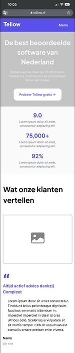
Remove 2 app buttons and place the CTA
Put more information related to the reviews
Reduce the image size to make it more clean
Reposition the CTA
More reviews without the photos of users
Mobile version
Before
After


Outcome
Google Analytics
Before and after the design, the Google Analytics data was appropriately evaluated. Data from February 2 to February 21 is shown here.
Numbers of “New sessions”
An estimate of the percentage of first time visits
15,82%
increase
Average time on the page
The average amount of time users spent viewing a specified page or screen, or set of pages or screens
54,21%
increase
Average page depth
the number of your web pages that a visitor views during a single browser session.
25,6%
increase
Retrospective
What I've learned
-
Before beginning design, it's critical to understand the type of content that users expect from this page.
-
Always take the responsive website into account.
-
Learning how to select which feedback to use is essential.
Challenge
Context
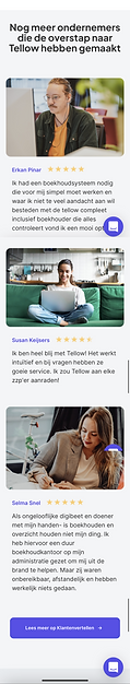
In the desktop version, there is more room to display three reviews at once on one screen, but only one review can be displayed at a time on the mobile version. I had to come up with another option, therefore.
Resolution
I was inspired by the way other websites dealt with this issue and created this horizontally scrollable window to display the reviews on the mobile edition, allowing the user to browse all reviews at the same position of the screen. Moreover, I made two of the review's sides smaller than the main one to suggest that there are more reviews.
Desktop version

Mobile version
%201.png)