
Complete redesign of the FieldBuddy homepage
A full homepage redesign focused on improving visual clarity, usability, and overall user experience across both desktop and mobile.
The goal was to help users quickly understand the product, navigate the site with ease, and find the resources they need without friction.
.png)
Role
Graphic (UX/UI) designer

Duration
1.5 months
.png)
Tools
Figma
Photoshop
Project overview
FieldBuddy is a field service management platform built to support growing service businesses across planning, execution, and reporting.
The homepage redesign focused on clarifying the product value, improving first-time user understanding, and aligning the visual language with FieldBuddy’s evolving brand, while maintaining strong conversion performance across both desktop and mobile.
The detailed design requirements and constraints that shaped these goals are documented in the Research section.
Goals & Objectives
-
Conversion & CTA Strategy
-
Clearly communicating what FieldBuddy does within the first few seconds
-
Telling a cohesive product story, guiding users from overview → benefits → action
-
Improving visual hierarchy and content scannability
-
Delivering a responsive, mobile-first experience
-
Aligning UI components with a modern, scalable SaaS design system
Design Process
01
Problem Statement
02
Information Architecture
03
Visual Hierarchy & Layout
04
Responsive & Mobile Design
Problem statement
I reviewed the existing homepage and identified several areas for improvement that were impacting clarity, consistency, and user confidence.


-
Some key issues:
-
The gradient blue color looks less professional.
-
As requirements, need to add a secondary CTA for 15-mins call.
-
The visual hierarchy didn’t clearly guide users toward primary actions
-
Inconsistent layout.
-
Brand expression felt inconsistent across sections
As a result, users had difficulty quickly answering:
“Is this the right solution for my business?”


Research
Before starting the competitor analysis, I first reviewed all the project requirements. Below is a summary of the key requirements that guided my research.
Design Requirements
-
Conversion & CTA Strategy
-
Introduce a secondary CTA (15-minute consultation call)
-
Include one primary demo request CTA in the header, with one or two supporting CTAs further down the page
-
Avoid over-emphasising demo requests to keep the experience approachable and informative
-
Add a final CTA section at the bottom of the page, summarising key benefits with checkmarks
-
Visual & UI Direction
-
Create a clean, professional, and modern SaaS aesthetic
-
Use concise, concierge-style copy that is easy to scan
-
Use a static hero image to keep focus on the primary CTA
-
Ensure all feature visuals share consistent sizing to reinforce visual clarity and professionalism
-
Introduce high-quality visual effects (subtle 3D or innovative UI treatments) to elevate perceived product quality
-
Use custom-created GIFs to demonstrate product functionality
-
Content Structure & Navigation
-
Add interlinking components that guide users to:
-
Blog articles
-
Feature pages
-
-
Remove the pricing component from the homepage to reduce early decision friction
-
Trust & Credibility
-
Include trust-building components, such as:
-
Customer testimonials
-
Partner or customer logos
-
-
Create a dedicated integrations component
-
Display integration partner logos clearly, allowing users to quickly assess compatibility
-
-
Nice-to-Have Enhancements
-
Add an FAQ section to address common questions and reduce uncertainty for first-time visitors
-
Copy & SEO Requirements
-
Maintain a strong SEO focus
-
Primary keyword: Field Service Management
-
Secondary keywords: werkbon
-
-
Use clear, user-friendly language that aligns with how customers speak and search
-
Collaborate closely with the Sales team to ensure messaging accuracy and consistency
After that, I started with a competitive analysis to identify key user needs and industry patterns. Due to time constraints, formal user interviews were not conducted; instead, I gathered insights from the internal support team, who regularly interact with customers and understand common pain points.
Competitors analysis
I conducted a competitors analysis of eight field service management platforms to better understand market patterns, user expectations, and common design approaches.
I summarized the findings in a slide deck and shared it with key stakeholders to gather feedback and align on priorities before moving into design execution.

-
Key Takeaways:
-
Limit the number of features highlighted on the homepage to a maximum of ten to avoid cognitive overload
-
Use a static hero visual to maintain focus on the primary call-to-action
-
Avoid mentioning pricing on the homepage to reduce early decision friction
-
Place FAQs in the footer and introduce a dedicated FAQ page to centralize common questions
Information Architecture
After gathered all the information, I started with the information architecture. The page was restructured to follow a clearer narrative flow:
-
Clear value proposition
-
Product overview
-
Key capabilities
-
Supporting visuals & context
-
Conversion actions
Each section was designed to answer one core question before moving to the next.
Visual Hierarchy & Layout
After finished the information architecture, I moved on with the Visual Hierarchy & Layout.
Key improvements included:
-
Enhanced brand consistency
-
Stronger headline and sub-headline contrast
-
Clear primary and secondary CTAs
-
Modular section blocks for better scanning
-
Consistent spacing and alignment
-
Visual rhythm to guide scrolling behavior
This helps users understand, not just see, the content.
Before reaching the final version, this layout went through six rounds of iteration.
1st idea - initial design
Based on the initial analysis, I explored the first homepage concept and made the following design decisions:
-
Header & Hero Area
-
Replaced the gradient blue with a solid blue to create a more professional and consistent brand presence
-
Introduced a static hero visual to keep attention focused on the primary call-to-action
-
Added a secondary CTA to allow users to easily book a call
-
-
Layout & Content Structure
-
Standardised the size of feature visuals to improve visual consistency and clarity
-
Grouped features into three columns to improve scannability and categorisation
-
Introduced an integrations section and removed pricing from the homepage to reduce early decision friction
-

-
Usability & Conversion
-
Moved FAQs directly onto the homepage to give users faster access to answers
-
Added a final CTA section with checkmarks summarising key benefits and reinforcing the value proposition
-

6th idea - integrated stakeholders' feedback
To incorporate stakeholder feedback, I explored additional patterns and references through online research to better understand how users engage with and process homepage content. In parallel, I collaborated with the marketing manager to brainstorm alternative approaches and interaction ideas.


Style guide
The redesign follows FieldBuddy’s existing design system, using the established primary brand colors and typography to ensure visual consistency across the product and marketing surfaces.
1. Color palette
-
Primary colors
#0D3754
#00AAFF
-
Secondary colors
#F3F9FF
#5F7382
#F0F0F0
#FFFFFF

#FCA53E
#FF6F6F
2. Typography
Header text
Aa
Montserrat
Body text
Aa
Open Sans
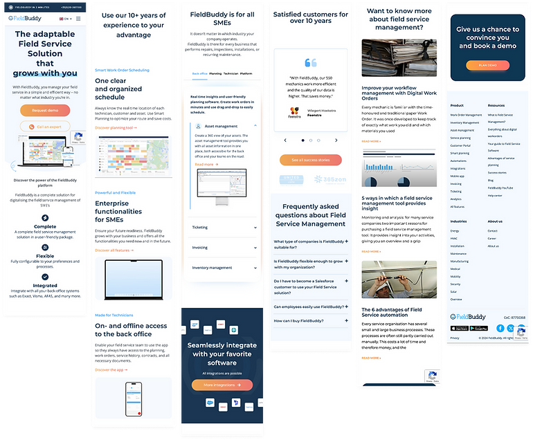
Final Design
Desktop version


Mobile version
Outcome
Following the homepage redesign, website performance and user engagement improved significantly.
Branded search
Growth in brand-related search queries (Jan–May 2023 vs 2024)
77%
increase
Total users
Total number of users visiting the website
172%
increase
Average time on website
The average time users spent on the website
186%
increase
Overall, the redesign helped users better understand the product, engage more deeply with the content, and stay longer on the site, which supports both brand growth and conversion goals.
Retrospective
What I've learned
-
Aligning on project scope and expected outcomes early is essential, which requires identifying and involving key stakeholders from the start
-
Understanding the type of content users expect from the page is critical before moving into visual design
-
Responsive behavior should always be considered throughout the design process, not as a final step
-
Learning how to evaluate and prioritise feedback is a crucial design skill
Challenge
Context
This project wasn’t just a redesign. It was a fresh start.
The goal was to rethink the homepage from the ground up while aligning with a broader rebranding direction.
That meant balancing two big challenges at once:
-
Creating a modern, refreshed experience that felt new and forward-looking.
-
Staying aligned with evolving brand guidelines and stakeholder expectations.
Rather than improving small details, the challenge was to redefine how FieldBuddy presents itself visually, structurally, and emotionally to first-time visitors.
Resolution
I approached the project as both a redesign and a rebrand exercise.
First, I aligned closely with stakeholders to understand the new brand direction and expectations. Then, I explored multiple visual and structural concepts to test how the new identity could live on the homepage.
Through rapid iterations, feedback sessions, and continuous refinement, the final design balanced a fresh visual language with clarity, usability, and brand consistency. It successfully translates the new brand direction into a strong first impression.