
6Pro
6Pro is a responsive web app that enables you to get fast help from an expert in virtually any field.
.png)
Role
UX/UI Designer
OVERVIEW

Duration
6months
.png)
Tools
Miro
OptimalSort
Adobe XD
Figma
About the project
We've been in a situation where we need a piece of advice from the professionals but can't get it sometimes. Even though there is much information online nowadays, people need to spend more time figuring out which solution fits their current situation. To resolve this problem, I have designed a new expert app that provides people a way to get fast help from an expert in 6 fields.
Objective
From the result of the user research, I found out that since the technology is becoming more advanced, the problems encountered by everyone are also becoming more extensive. So this project aims to create an expert app that supports multiple categories.
Process
I have applied User-centered design process to this project to match the potential users' needs with well-designed, technologically feasible solutions.
01
UNDERSTAND
Problem statement
Competitor analysis
02
OBSERVE
User survey
User interview
03
POV
Personas
User journey
User flow
04
IDEATE
Sitemap
Card-sorting
05
PROTOTYPE
Mid-Fi Wireframes
06
TEST
Usability testing
Final design
UNDERSTAND
Problem statement
Our expert app users need a way to get a solution while facing problems in any field because they wish to save time from searching online and not be overwhelmed by the scattered information.
We will know this to be true when we see how many users use our app to resolve their problems and get a solution every time they reach out to the experts.
Competitive analysis
Before getting into the design process, I would like to perform a competitive analysis to gain an understanding of similar applications in the market. During the process, I incorporated the SWOT analysis method to figure out what strengths they contain to gain higher customer satisfaction and learn from their weaknesses so that I can improve them and apply them to my app. Here are two expert responsive web apps I've researched: JustAnswer and 6ya.
Main takeway
Learning from JustAnswers, I would like to offer 24/7 service for the users so they can contact our experts whenever they encounter difficulties. And from 6ya, I would like to offer a free Q&A page that collects the solutions for frequently asked tech issues to help people organize the documents and solve their concerns without any payments. However, from the other side of the weakness of both, I would clearly illustrate the price list since this would be the most concern by the users.
1. Justanswer
Strengths
-
Super convenient. Unlimited conversation 24/7.
-
Verified experts in various fields.
-
Browse the previously answered questions without signing up.
Weaknesses
-
Lack of transparency on the pricing.
-
Expensive cost for membership subscriptions.
-
Need to take a while to get a response from an expert.
Opportunities
-
It should clearly illustrate the price list.
-
It would be better to show the expected time they need to wait.
Threats
-
There are many expert apps on the market, and most of them charge per case instead of a monthly subscription.
-
The membership subscriptions are relatively higher.
2. 6ya
Strengths
-
Instant help. The experts will get back in 30 seconds.
-
Experts are thoroughly vetted and knowledgeable.
-
Cheaper membership subscriptions.
-
Offers a free Q&A page that collects the solutions for frequently asked tech issues.
Weaknesses
-
Lack of transparency for the pricing.
-
The button “All Categories” and “Find Experts” confuse the users.
-
It is hard to find the categories.
-
Currently, it only offers the service in the U.S.
Opportunities
-
It should clearly illustrate the price list.
-
It offers the service in other countries.
Threats
-
There are many expert apps on the market, and they offer services in many countries, for example, JustAnswer.
OBSERVE
After understanding the competitors and concluding on what to implement and improve, I've started to conduct user research to understand our potential users' needs and goals. I believe that incorporating user surveys and user interviews will help me obtain qualitative and quantitative information from my target audience. Here are the results I've acquired below:
Survey insights

Approach to
seek a solution
63.3% search online.
20% reach out to an expert.
16.7% ask friends or colleagues.

Paid for an
expert service
56.7% never.
43.3% yes.

Important feature
in expert app
50% pricing list.
40% communication method.
6.7% category.
3.3% top experts.


Time limits for
a response
33.3% longer than 60 mins.
30% 10-30 mins.
23.3% less than 10 mins.
13.3% 31-59 mins.
Interview insights

POINT OF VIEW
User Personas
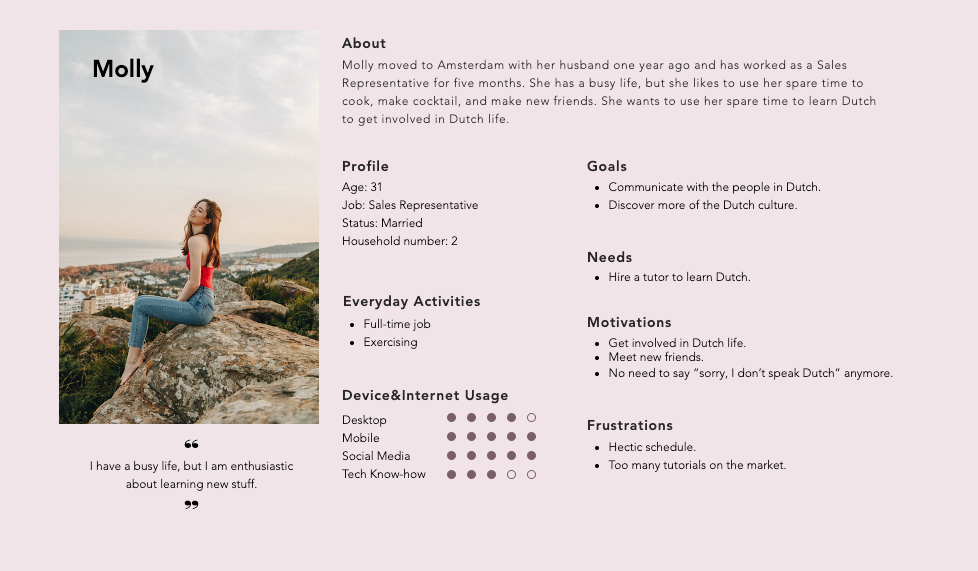
Based on the information I obtained from the user research, I identified two different characteristics and decided to develop two user persona to be the portrayal of two target users for 6Pro, which can give my research a human face and narrative and help me put the users in the first place through the design process. Here are two different proto-personas with their demographics, behaviors, needs, and goals below.

User Journey
To better understand what the users will feel when they go through the task, I've built a user journey map for our primary goal - book an appointment with an expert. Through the phase, it would help me break the task into small chunks and see if there's an opportunity to improve the design.

User flow
We can tell that Brenden and Molly have different goals and needs. One needs a mortgage advisor, and another needs a language tutor. According to their distinct demands, I mapped out two task flows in which I’ve considered all possible situations and navigational issues to complete a particular task.

Objective
As a young adult with a limited budget, Brenden wants to check the price list to hire a mortgage advisor and the service information they offer first before reaching out to a mortgage advisor to save more money on other stuff.
-
Entry point:
Log In page.
-
Success Criteria:
View the pricing list and the service information.


Objective
As an expat in the Netherlands and with a hectic schedule, Molly wants to find a high-rating Dutch tutor who can fit her availability for lectures and book an appointment to check everything before starting the course so that she can use her spare time to learn Dutch and get more involved into the Dutch culture.
-
Entry point:
Onboarding pages.
Get the appointment confirmation.
-
Success Criteria:

IDEATE
After identifying two different user flows for Brenden and Molly, I created a sitemap to outline the hierarchy of this application. To understand whether the sitemap I had in mind aligned with the expectation of those potential users or not, I conducted a digital and closed card-sorting with six participants via OptimalSort.
Initial sitemap

Card-sorting

Revised sitemap
Regarding the results obtained from the card-sorting, I found out that some cards were less clear for the participants to choose from, so I revised the content and the name of the categories to make it align with the potential their expectations. For example, I found that the expert appointment was missing, so I added it to the next step of experts info. Further, some participants would feel confused about the terms "Technical help" and "Support" so I revised "Technical help" to "Technology."

PROTOTYPE
Mid-fidelity wireframes
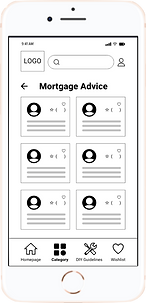
I have designed dozens of wireframes for completing the different tasks. Here, I will focus on three main task flows: browse experts, expert appointments, and DIY Guidelines.
Mobile


Desktop


TEST
Usability testing
After creating the mid-fi wireframes, I would like to see how the participants would perform the tasks from their point of view. Also, by viewing how they performed through the video call, I could see their pain points from their body languages. Here, I've conducted moderated in-person and remote tests with six participants. In this session, I will be focusing on the four test objectives listed below.
Test objectives
-
To observe how users navigate through the onboarding and the sign-up/login process.
-
To observe how users interact with the appointment booking process.
-
To observe how users navigate from the homepage and find the DIY guidelines to resolve common issues.
-
To identify if any friction occurs when the users do the tasks.
The findings below were organized in an affinity map with the observations, positive/negative quotes, and errors. After that, I created a test report measured under Jakob Nielsen's rating scale to see which errors are imperative to refine.
Findings

Test report
5/6 of participants couldn’t find the free resources because the name of DIY Guidelines is confusing. [HIGH]
Revision: Rename DIY Guidelines to Resources and add an introduction on the Home Screen.
3/6 of participants expected to know the reason why need to provide this information through the onboarding pages.[MEDIUM]
Revision: Move the name question to the sign-up page and edit the descriptions on each page.
6/6 of participants felt confused about the meaning of “M, A, E, N” on the calendar. [HIGH]
Revision: Remove the “M, A, E, N”.
2/6 of participants thought it’s not necessary to have duplicated content on Home Screen. [MEDIUM]
Revision: Change the content which displays on the Home Screen.
2/6 of participants felt confused about the pop-up text dialog after clicking the ADD button. [MEDIUM]
Revision: Edit the prototype and rename the button to Attachment.
Final design
After analyzing the valuable insights gathered from the usability testing, I started to make changes to my prototype based on our test report. Further, I've also upped the fidelity of my wireframes by following the visual design principles.

VISUAL DESIGN

Style guide
6Pro is about providing professional experts and advice to the people, so I would like to give a trustworthy and secure impression. One of the ways to engage the emotions is through the color palette and the tone of voice. Therefore, I chose to use a darker shade of blue to represent its trust and safety for the primary color. Further, to avoid the bland white background, I use a light shade of yellow to bring some vibrant.
1. Color palette
-
Primary colors
#2469A6
#F4F4E8
-
Secondary colors
#84B5E2
#9D9D9D
#F0F0F0
#FFFFFF
2. Typography
Aa
Raleway
Header1 - Welcome to 6Pro
Raleway - bold - 32pt - welcome page title
Aa
Roboto
Body text - Welcome to 6Pro
Roboto - regular - 12pt - Paragraph text, bottom navigation
Roboto - bold(12pt), regular(14pt) - buttons
Roboto - regular - 10pt - small text
Header2 - Welcome to 6Pro
Raleway - bold - 24pt - Subpage titles
Header3 - Welcome to 6Pro
Raleway - bold - 24pt - Subpage titles
3. UI elements
-
Buttons states

-
Bottom navigation
-
Button component in cards

5px
rounded corners
28px
Primary color: #2469A6
Text color: #FFFFFF
Text font: Roboto
Text size: 12pt, bold
Drop shadow: x:0, y:6, B:10, #2469A6(16%)
80px
-
Input fields


RETROSPECTIVE
What I've learned
-
Involving the potential users earlier will save more time and money.
-
The design is for the users, not the designers, so always put the users at the center of the decision-making process rather than business goals or gut feelings.
-
Creating the user personas makes me focus on the target user.
-
Conducting the usability testing helps me understand the users and the whole process better and improve the user usability of the app.
-
Feedback is a touchy subject, so it's essential to learn how to decide which feedback to implement.
Challenge
The greatest challenge I faced was to decide which topic to go with the expert app at the beginning. The reason was that as technology improves, the problems people encounter become more and more extensive. Rather than making up the topics by my gut feelings, I have conducted the user survey to understand what the users needed most, so it comes out the inspirations.
Next step
-
Conducting iterative testing to continue improving 6Pro's design and usability.
-
Add more detailed information to the content to make the design more complete.